Concept to final artwork: Christi du Toit’s illustration workflow in Affinity
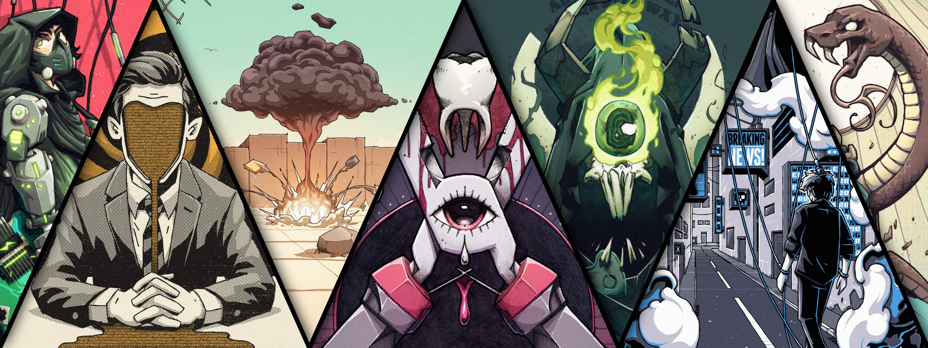
Known for creating richly detailed illustrations that blend hand-drawn character with digital precision, Christi du Toit has developed a distinctive style shaped by comic books, graphic design, and years of professional illustration work.
In this interview, he talks about the influences behind his work, why studying graphic design changed the way he thinks about illustration, and how he takes a project from the first rough sketch through to final delivery in Affinity.
How graphic design shaped Christi’s illustration process
Christi always knew he wanted to be an illustrator, but to get there he took a slightly different route.
“Drawing was never really the hurdle for younger me,” he says. “It was learning all of the creative theory and the technical and digital aspects.”
When he was studying, dedicated illustration courses weren’t as widely available as they are today, so he enrolled in graphic design instead. It turned out to be a decision that would shape both his career and the way he approaches visual communication.
“I’ve never regretted studying graphic design,” he says. “It really changed how I think about my work.”
That broader education taught him to think about illustration as part of a larger visual system: how a piece works on a product label, a book cover, or a piece of packaging, not just as a standalone image.
Developing a hand-drawn style
When asked to describe his visual style, Christi keeps it simple: “Digital, but hand-drawn. That’s really the core of it.”
While some illustrators embrace highly polished aesthetics, Christi is drawn to work that feels tactile and has the visual qualities of traditional tools.
“I don’t have an issue with work that looks and feels very digital, but I’ve always struggled to feel satisfied creating that type of work myself,” he reveals. “I love the gritty, ink-heavy aesthetic of comic books, the bold colors of cartoons and children’s books, and the limited palettes of screen-printed band shirts and gig posters. I think my work exists somewhere in the middle of all of that.”
Those influences still shape the work he creates today. The same goes for the software he uses. "Working the way I do, the primary digital tool in my workflow is, and always has been, a brush. But since switching to Affinity, I've become much more open to adopting new approaches and tools, such as vector tools and photo editing. Affinity just makes those things feel far less daunting. I can do it all without ever switching windows, let alone applications."
Christi’s digital illustration workflow
Every brief is different, but the core structure of Christi’s process stays consistent. Here’s how a typical illustration takes shape, from the first sketch to the final file handoff.
Phase 1: Concept development and planning
Christi explains: “Every illustration starts with exploration and problem-solving.”
He begins by drawing a few rough sketches to pitch initial concepts that could work well for the brief. These usually start as loose scribbles in a sketchbook before being cleaned up digitally and presented with a short rationale explaining the creative decisions behind each one.
Working this way allows him to explore ideas freely without becoming too attached too early or investing time polishing concepts that may never move forward.
He considers this the most important stage of the process, as every decision that follows comes back to how clearly the core concept is communicated.
Phase 2: Creating a refined digital sketch
Once the direction is approved, Christi moves into a more refined digital sketch, working in Affinity with a display tablet and a digital brush configured to mimic the texture and weight of a traditional graphite pencil.
Even at this stage, he’s already combining different tools to establish a strong foundation for the final piece. “I often lay out my compositions using vector guides, then switch over to raster brushes to create the actual drawing,” he explains.
He pushes his sketches as close to the final artwork as possible so most major creative decisions are solved before rendering begins. It’s a workflow that reflects the habits he picked up through graphic design: solve the problems early, then focus on execution.
Phase 3: Inking and linework in Affinity
With all of the planning and sketch work complete, he moves on to the linework, or ‘inking’, phase. Because he works primarily in raster formats, he creates artwork at roughly 1.5–2x the final print size to preserve detail and maintain clean edges when scaled down.
Although he loves textured and painterly brushes, jobs such as screen-printing call for something more solid and controlled. Because ink layers are limited, he leans on hatching and line detail to create movement and depth that color would otherwise provide.
Small workflow optimizations also play a role at this stage. “I’ve created custom shortcut keys to rotate my canvas incrementally, which helps a lot with drawing fine details, such as hatching, more accurately,” Christi says.
Phase 4: Adding color and value
He usually approaches color and value as two separate stages, but when working with a limited screen-print-friendly palette, the two become closely linked. A single color often has to do more than one job, functioning as both a base color and a way to create depth or shading.
For filling large areas of flat color, Christi relies on Affinity’s Freehand Selection Tool rather than painting with brushes. He finds it faster and more accurate, helping keep edges crisp and color separations clean for print production.
One technique he recommends is disabling antialiasing when laying down base colors. “When adding base colors, I uncheck antialiasing on my selection tools so that I can fill blocks of color without any gaps or aliased edges,” he explains.
Screen-printing also requires careful layer organization. Christi keeps to one layer per ink color and orders them from lightest to darkest, mirroring the print sequence and making files easier for printers or collaborators to work with.
Staying organized becomes increasingly important as artwork grows in complexity. “I love the ability to use Tab to fly through my layer stack, rename layers, and keep my files from becoming chaotic as a project progresses,” he says.
Phase 5: Preparing files for print and delivery
Once the artwork is finished, he presents it to the client with mockups and key stages from the process to provide context for the creative decisions. After sign-off, he prepares and exports the final deliverables: flattened files for digital use, correctly structured layered files for print, and any additional formats specified in the brief.
Tips for illustrators switching to Affinity
After years of building his workflow around Affinity, Christi has a clear view of what helps new users get the most out of it.
“Affinity is its own beast. While it can absolutely replace other software in terms of handling similar tasks, I think it offers far more than that. The combined vector, pixel and layout tools and the level of customization mean you can have everything you need at your fingertips within a single app, regardless of the type of work you’re doing.”
For Christi, taking advantage of that flexibility starts with setting the software up to suit the way you work.
His first recommendation is to make the interface yours before you do anything else. “Take the time to build your ideal setup, especially using shortcuts you’re already familiar with. It makes everything feel comfortable very quickly.” Affinity lets you build a custom Studio with tools arranged exactly how you want them. Get that right early and your attention can stay on the work.
His second piece of advice is about commitment over curiosity. “Take a real project from start to finish in Affinity. Treat any initial friction as part of the learning process.”
Testing individual features rarely shows what the software is capable of. The real workflow benefits only become clear when you take a project all the way through to completion. That’s how it clicked for Christi. “By the end of that first project, I knew it would become my primary tool.”
Explore more of Christi’s work
From rough concepts to final delivery, Christi’s process is built around the same principle: solve the idea first, then execute it well. It’s an approach that has helped him develop a distinctive visual style while remaining adaptable across a wide range of commercial projects.
To discover more of Christi’s work and learn more about his creative approach, explore his profile on Spotlight. You can also download a selection of custom illustration brushes and assets inspired by his workflow and use them in your own projects.


