Affinity Essentials Lesson 6: How type works
1 Min read
Published
Understanding Type in Affinity
If you control type, you control attention. In this lesson, you’ll get hands-on with Affinity’s type tools and learn how to shape, refine, and control text for maximum impact.
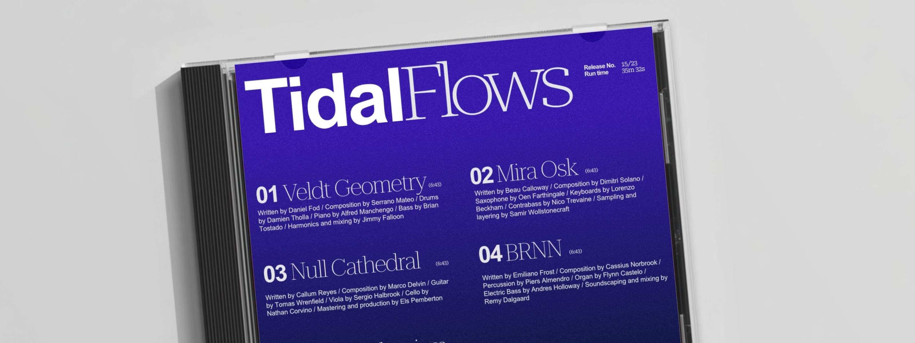
Using an editorial design by artist Isabela Humphrey as your foundation, you’ll work with frame text, artistic text, and tables to build flexible layouts. We’ll then show you how to align and distribute elements with precision, adjust leading, tracking, and kerning for stronger legibility, and experiment with variable fonts for more granular control.
Lesson objectives
By the end of the lesson, you’ll be able to:
- add and format frame text, artistic text, and tables
- align and distribute text elements with precision
- adjust leading, tracking, and kerning for improved legibility
- experiment with variable fonts and editable axes
- create and apply character and paragraph styles
- manage typography confidently across your designs
Lesson resources
Before you begin, make sure you’ve downloaded Affinity and logged in using your Canva ID. You’ll also want to download the Lesson 6 source file to follow along.


